Sorry to jump on the top-n list bandwagon, as Vi Hart deliciously parodies, but that’s just how this one shakes out. Some of the reasons why these things are done wrong are pretty advanced, but if you’re a high school student who stumbled upon this blog, please stay and read. Know that it’s okay that you won’t get everything.
All of these gripes stem from the same source: they obfuscate what ought to be clear and profound ideas. They’re why math is hard. Like a smudge on a telescope lens, these practices impair the tool used to explore the world beyond us.
EDIT: This list focuses on notation and naming. There are other “things” done wrong in math class that any good teacher will agonize over with far more subtlety and care than this or any listicle.
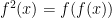
5. Function Composition Notation
Specifically 


Nested parentheses lend themselves to function iteration, 


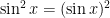
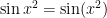


4. The Word “Quadratic”
I’m putting “quadratic” where it belongs: number four. The prefix quadri- means four in every other context, dating back to Latin. (The synonym tetra- is Greek.) So why is 


3.14 Pi
Unfortunately, there is a case when we have to invent a new term and get people to use it. We need to replace pi, because pi isn’t the circle constant. It’s the semicircle constant.
The thrust of the argument is that circles are defined by their radius, not their diameter, so the circle constant should be defined off the radius as well. Enter tau, 


If you’ve never heard of tau before, I highly recommend you read Michael Hartl’s Tau Manifesto. But my personal favorite argument comes from integrating in spherical space. Just looking at the integral bounds for a sphere radius R:

It’s immediately clear that getting rid of the factor of two for the 


However, theta goes all the way around the circle (think of a complete loop on the equator). Phi only goes halfway (think north pole to south pole). The half emphasizes that phi, not theta, is the weird one. It’s not about reducing the number of operations, it’s about hiding the meaningless and showing the meaningful.
2. Complex Numbers
This is a big one. My high school teacher introduced imaginary numbers as, well, imaginary. “Let’s just pretend negative one has a square root and see what happens.” This method is backwards. If you’re working with polar vectors, you’re working with complex numbers, whether you know it or not.
Complex addition is exactly the the same as adding vectors in the xy plane. It’s also the same as just adding two numbers and then another two numbers, and then writing i afterwards. In this case, you might as well just work in 


Complex numbers are natively polar. Every high school student (and teacher) should read and play through Steven Witten’s jaw-dropping exploration of rotating vectors. (Again students, the point isn’t to understand it all, the point is to have your mind blown.) Once we’ve defined complex multiplication – angles add, lengths multiply – then 


Even complex conjugates work better with angles. Instead of an algebraic argument and a formula to memorize, we can geometrically see that we we need to add an angle that brings us back to horizontal, which is just the negative of the angle we already have. This is mathematically equivalent to changing the sign on the imaginary component of the vector, but cognitively it’s very different. You can, with clarity and precision, see what you are doing in a way numerals can never express.
1. Boxplots
Boxplots make the top of the list because they’re taught at a young age and never challenged. They are brought up as a standard way to visualize data, when the boxplot was a relatively recent invention of one statistician, John Tukey. Edward Tufte has proposed variants which dramatically reduce the ink on the page. They are much easier to draw, which is important when you want to convince children that math isn’t about meticulous marks on the page. They have no horizontal component, so in addition to being more compact, they also do not encode non-information in their width.
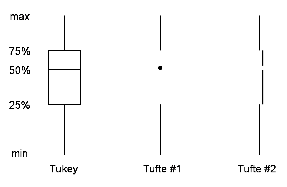
Boxplots infuriate me because they indoctrinate the idea that there is one way to do it, and that it is not up for discussion. More time is spent on where to draw the lines than why quartiles are important, or how to read what a boxplot says about that data. Boxplots epitomize math as a recipebook, where your ideas are invalid by default and improvisation is prohibited. Nothing could be further from the truth. Moreover, boxplots slap a one-size-fits-all visualization on the data without bothering to ask what other things we could do with them. Tukey’s plots don’t just obscure the data, they obscure data science.
